Assembly Builder — Layout
Layout View Overview
Introduction to Layout View
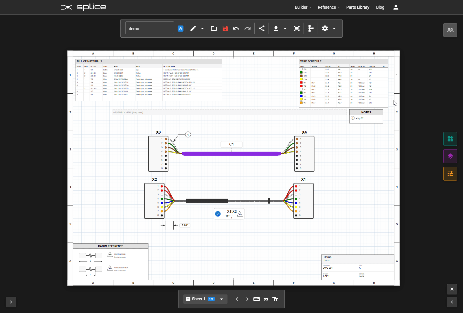
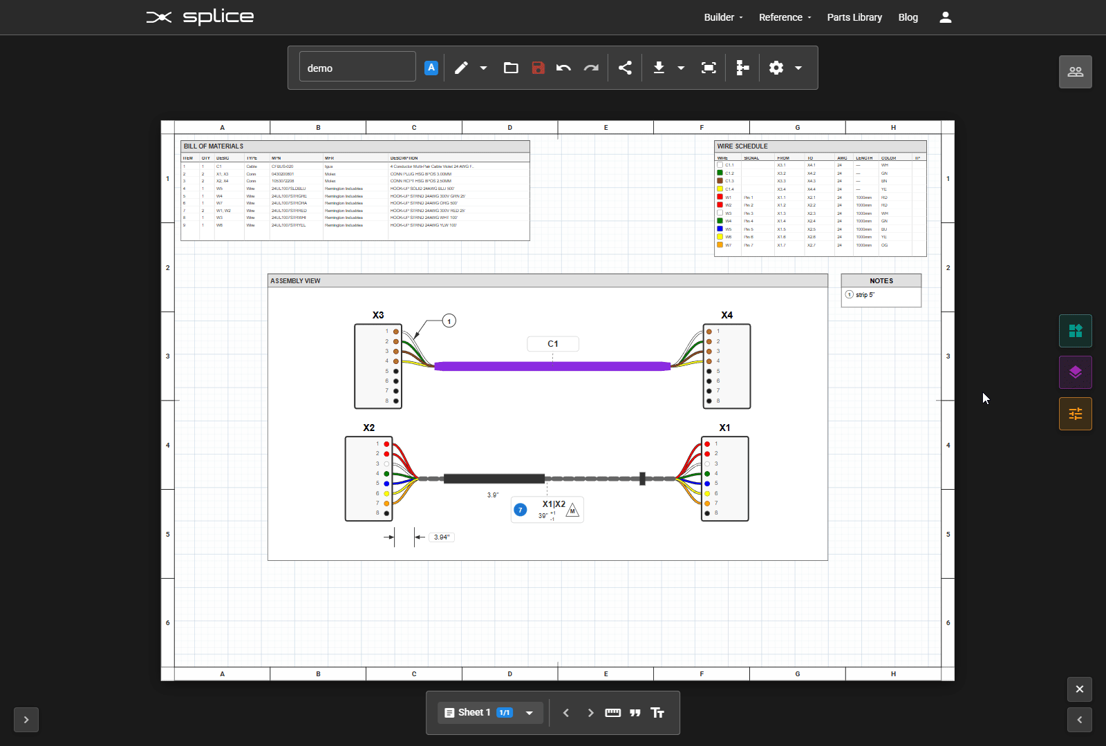
The Layout View transforms your schematic harness design into manufacturing documentation. Create multi-page drawings with assembly views, tables, and annotations.
Accessing Layout View
To access Layout View, click the ruler icon () in the toolbar at the top of the canvas, on the right side near the settings. This will switch from Schematic View to Layout View.
Key Features
- 2D Assembly Views - Interactive representations of your cable assembly
- BOM Tables - Automatically populated bill of materials
- Wire Schedules - Complete wire connection tables
- Dimensions & Annotations - Measurement callouts and notes
- Standard Drawing Elements - Title blocks, legends, and more
Switching Views
Switch between Schematic and Layout views using the ruler icon () in the toolbar on the right side. Changes in the schematic are automatically reflected in Layout View elements.
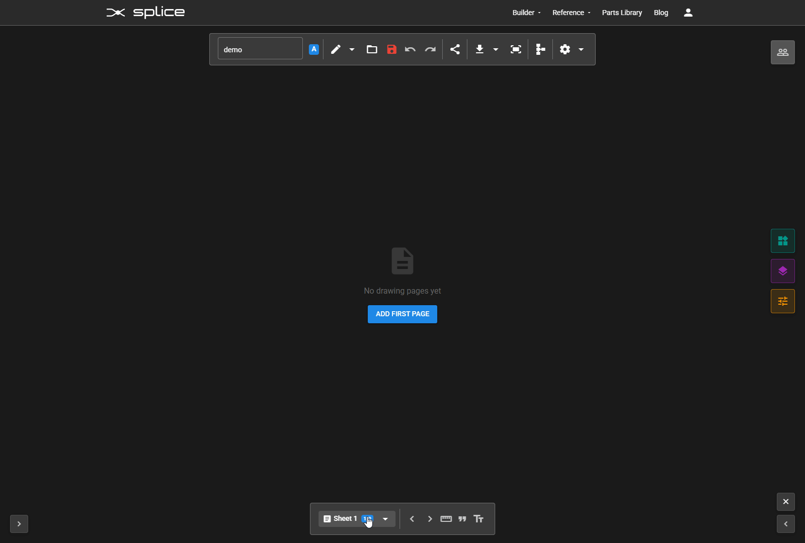
Page Management
Managing Drawing Sheets
Pages are managed primarily through the bottom toolbar. Click the page selector dropdown () to see all your sheets and manage them. Each sheet can have its own size, orientation, and content.
Page Selector (Bottom Toolbar)
The bottom toolbar shows your current page with navigation controls:
- Page Dropdown - Click to see all pages and select one
- Previous/Next - Use / to navigate between pages
Adding Pages
Open the page dropdown and click Add New Page () at the bottom of the list. Choose from several page sizes:
- Letter (8.5" x 11") - US standard
- A4 (210 x 297mm) - International standard
- A3 (297 x 420mm) - Larger drawings
- A2 (420 x 594mm) - Large format drawings
Editing & Deleting Pages
In the page dropdown, each page has action buttons:
- Edit () - Modify name, size, orientation, and border settings
- Clone () - Duplicate the page with all its elements
- Delete () - Remove the page
The Drawing Canvas
Canvas Navigation
The center area is your drawing canvas. It displays the page with a realistic paper appearance, showing the actual printable area.
Navigation Controls
- Zoom - Click / or use scroll wheel
- Fit - Click the fit screen icon () to see the entire page
- Pan - Scroll to move around the canvas
Grid & Snapping
Elements snap to a grid for precise alignment. The grid helps maintain consistent spacing and professional layouts.
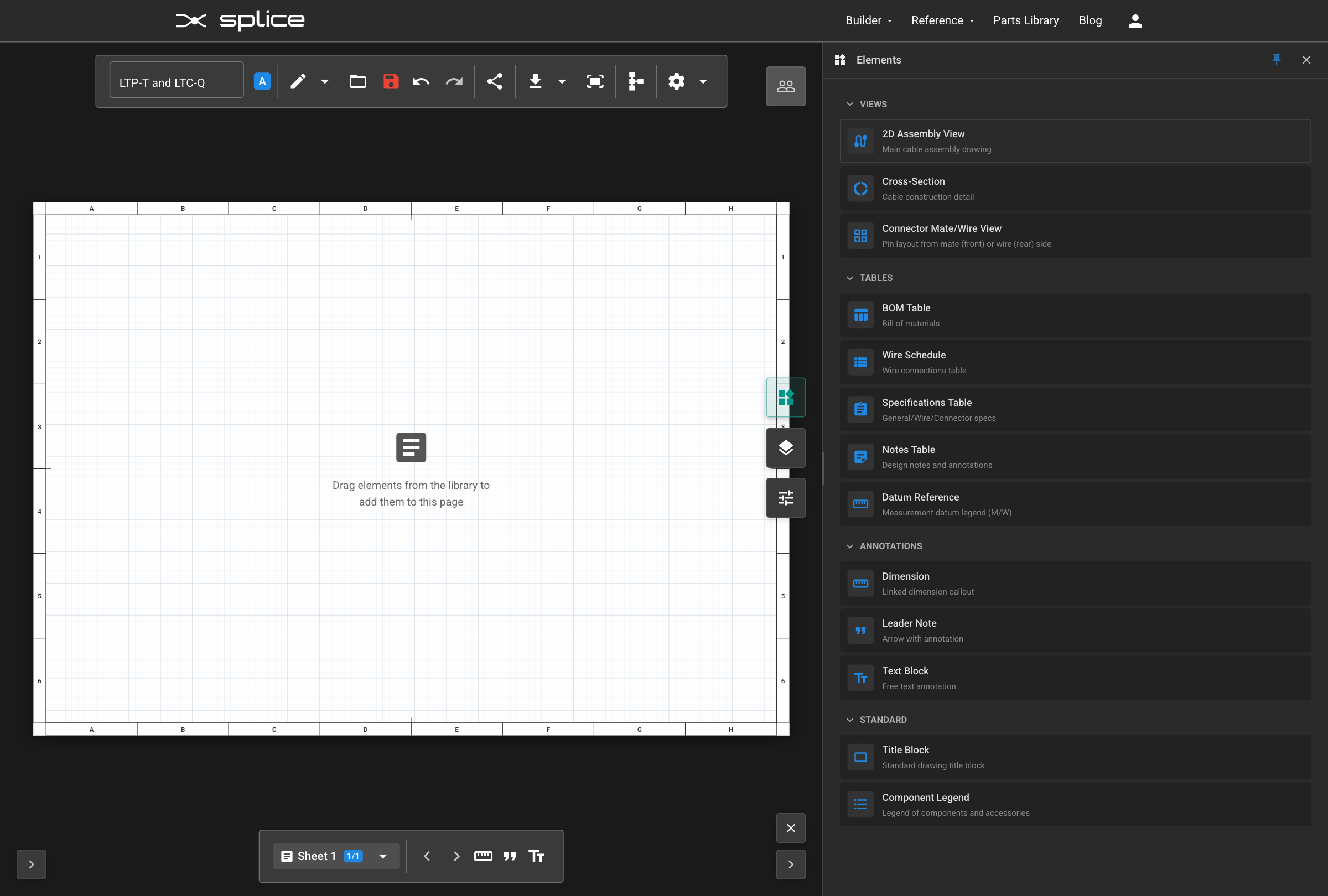
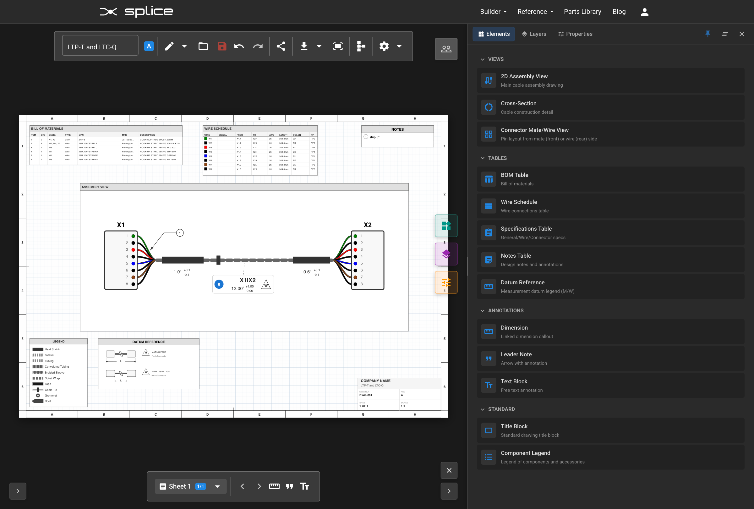
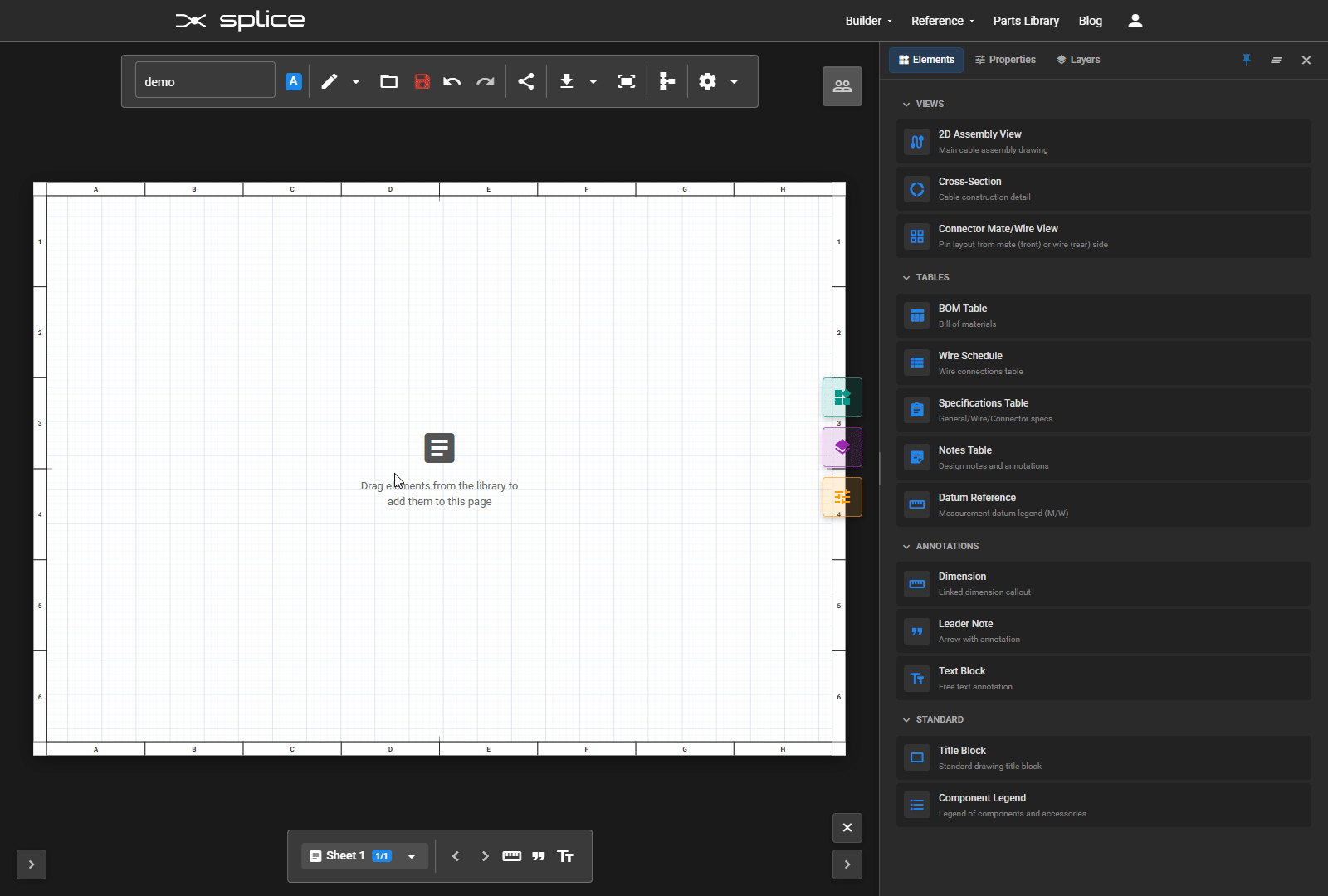
Element Library
Available Drawing Elements
The Element Library contains all the drawing elements you can add to your pages. Toggle it by clicking the add box icon () in the top-right of the toolbar. When open, the icon changes to .
Library Categories
- Views - 2D Assembly View, Cross-Section, Connector Front View, Stripping Detail
- Tables - BOM Table, Wire Schedule, Specifications, Notes, Datum Reference, Stripping Schedule
- Annotations - Dimension, Leader Note, Text Block
- Standard - Title Block, Component Legend
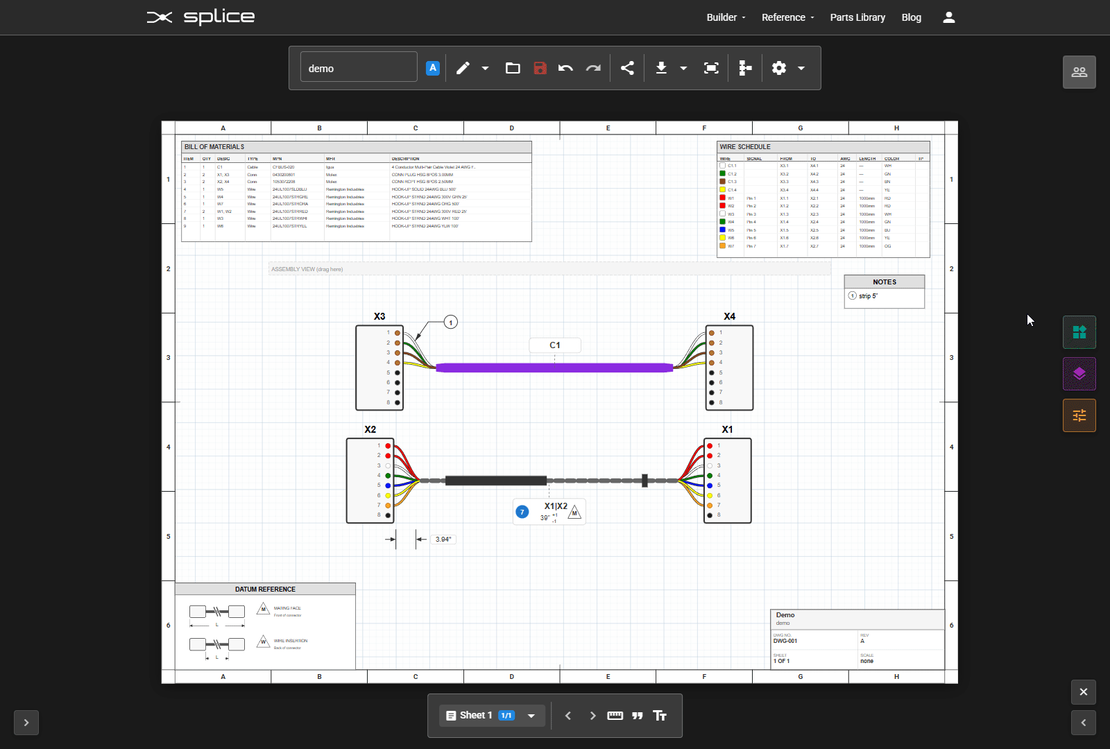
Adding Elements
Drag and drop elements from the library onto the canvas. Elements can be repositioned, resized, and configured after placement.
Adding Assembly Views
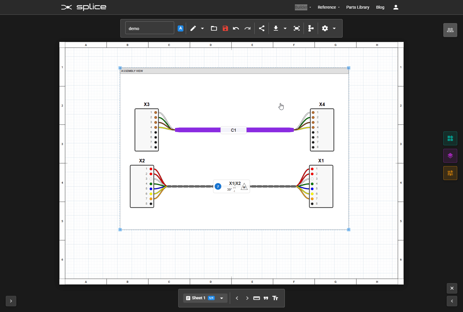
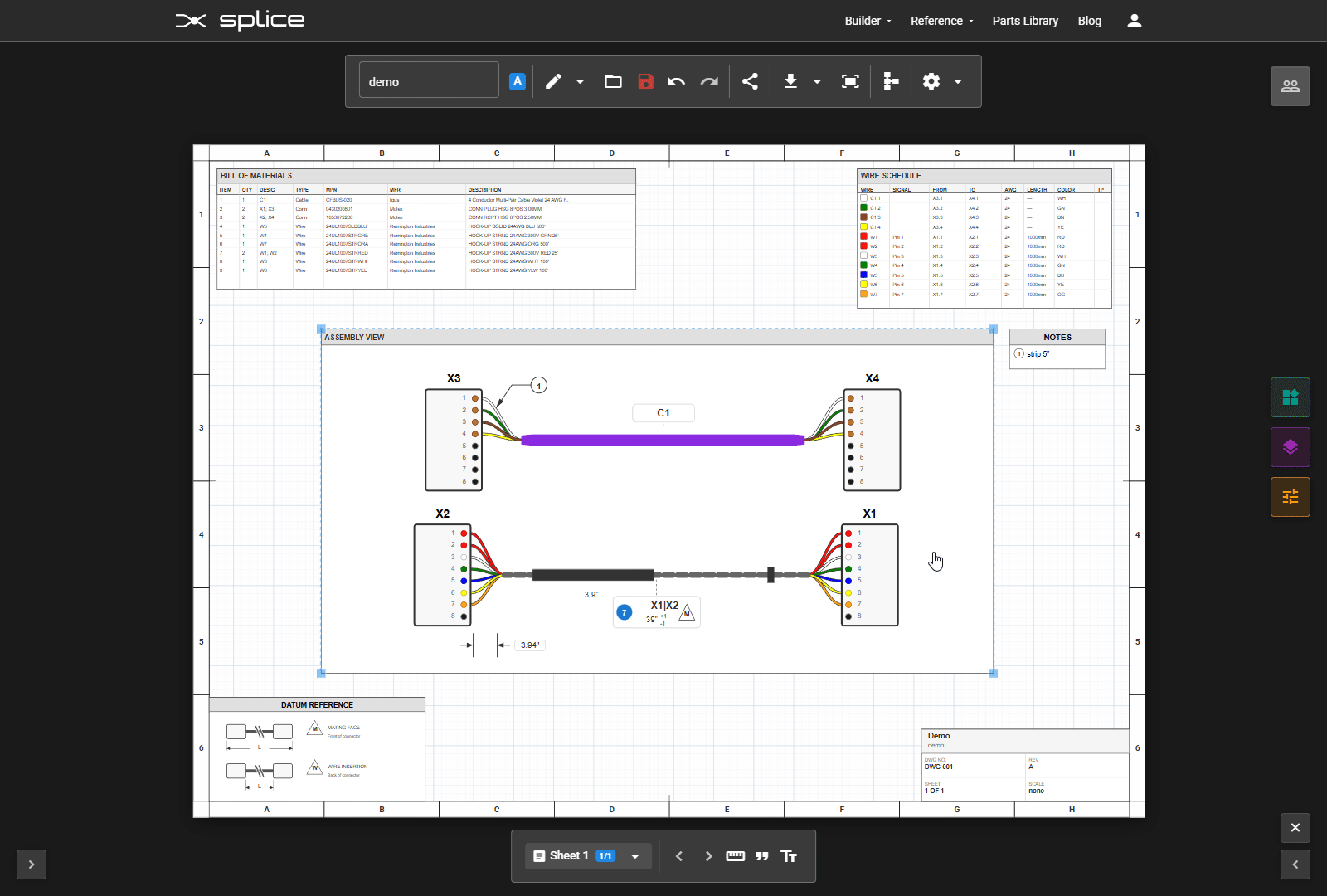
2D Assembly View
The 2D Assembly View is the centerpiece of your drawing. It creates an interactive representation of your cable harness from the schematic design.
Working with Assembly Views
- Resize - Drag corner handles to change the view dimensions
- Move Connectors - Drag connectors within the view to reposition them
- Multi-Connector Cables - Drag breakout endpoints to adjust cable fan-out positions
- Configure - Use the properties panel to adjust display options
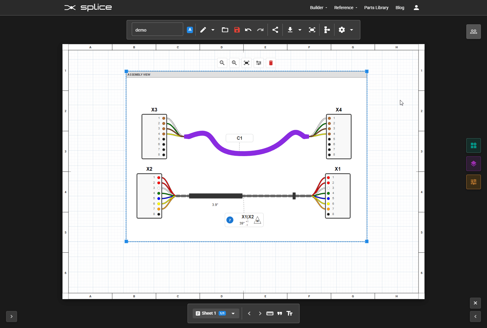
Reshaping Cable Paths
Cable and bundle paths can be customized for better layout:
- Double-click on a cable/bundle to enter Bezier edit mode
- Add anchors - Click on the path to add control points
- Move anchors - Drag anchor points to reshape the curve
- Remove anchors - Select and delete unwanted control points
Accessories
Accessories are added in the Schematic View and appear automatically in your assembly views:
- Adding accessories - In Schematic View, right-click a bundle → "Bundle Properties..." → click "Add" to choose: Heat Shrink, Cable Tie, Sleeve, Tubing, Convoluted Tubing, Braided Sleeve, Spiral Wrap, Tape, Grommet, or Boot
- Positioning - In Layout View, drag accessories along the cable path to reposition them
- Resizing - Drag the start/end handles to adjust coverage length
- Dimensions - Accessory dimensions are shown automatically (toggle in Bundle Properties)
Connector Appearance
Connector shapes are automatically detected from the part specifications (D-sub, circular, ring terminal, ferrule, quick-disconnect, etc.). The properties panel allows further customization of labels, designators, and styling.
Layout Options
The properties panel provides layout tools to help arrange your assembly view:
- Arrange from Schematic - Positions connectors and cables based on their layout in the schematic view, scaled to fit the assembly view bounds
- Reset to Auto-Layout - Clears all manual position overrides and returns to automatic layout (appears when positions have been manually adjusted)
Stripping Detail View
The Stripping Detail element provides a visual representation of cable stripping specifications for a specific cable end. It shows the strip length dimensions in an easy-to-read diagram format, complementing the Stripping Schedule table.
Adding Tables
Table Elements
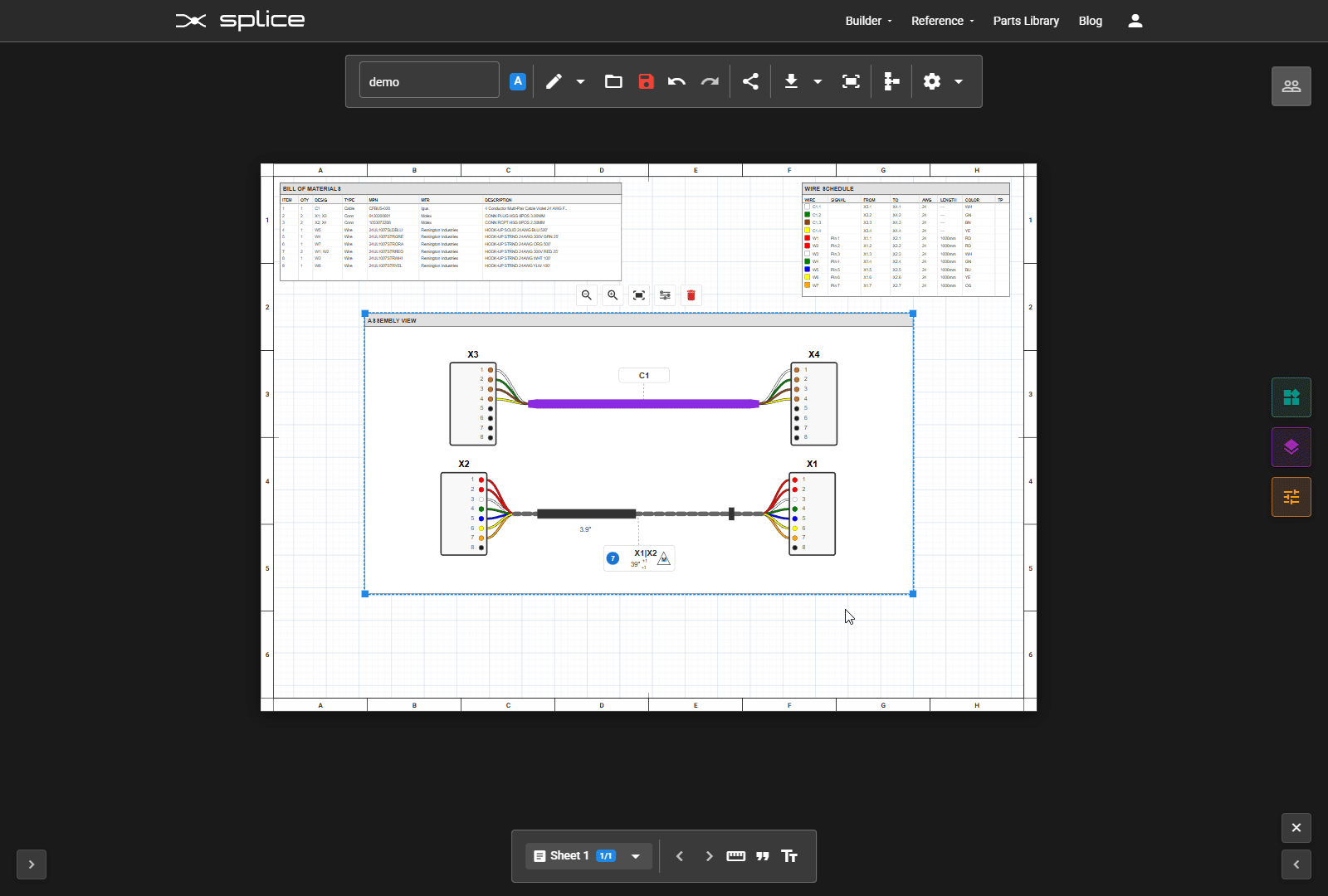
Tables automatically populate data from your schematic design, ensuring consistency between your documentation and design.
BOM Table
The Bill of Materials table lists all components in your design with item numbers, part numbers, descriptions, quantities, and manufacturer information.
Wire Schedule
The Wire Schedule provides complete wire connection information including wire designations, From/To connections, and wire specifications.
Stripping Schedule
The Stripping Schedule table documents cable stripping lengths for manufacturing, showing strip dimensions for each cable end.
Other Tables
- Specifications Table - General, wire, and connector specifications
- Notes Table - Design notes and special instructions
- Datum Reference - Measurement datum legend
Customizing Tables
Select a table to access its properties panel where you can show/hide columns, adjust column widths, and modify text styles.
Annotations & Dimensions
Adding Annotations
Add measurements, callouts, and notes to document your design requirements. Use the annotation tools in the left side of the toolbar.
Dimensions
Dimension elements can be linked to actual wire lengths from your design. Click the ruler icon () in the toolbar to add a dimension.
Leader Notes
Click the quote icon () to add a leader note. Leader notes include an arrow pointing to a specific location with accompanying text. Use them for:
- Callouts to specific components
- Special instructions
- Reference notes
Text Blocks
Click the text icon () to add free-form text blocks for general notes, instructions, or labels. Double-click to edit text content.
Standard Elements
Standard Drawing Elements
Add professional standard elements to complete your drawing documentation.
Title Block
The standard drawing title block includes:
- Drawing title and number
- Revision information
- Date and author
- Company information
Component Legend
A legend showing all components and accessories used in the design with their designators and descriptions.
Element Properties
Properties Panel
When you select an element, the Properties Panel appears on the right side with element-specific settings.
Common Properties
- Position - X and Y coordinates
- Size - Width and height
- Rotation - Element rotation angle
Element-Specific Properties
Each element type has unique properties:
- Text elements - Font size, style, alignment
- Tables - Column visibility, cell formatting
- Assembly views - Scale, display options
Layer Management
Layers Panel
Open the Layers Panel by clicking the layers icon () in the toolbar. The panel shows all elements on the current page and provides control over their arrangement, locking, and deletion.
Layer Controls
- Reorder - Click or to change stacking order, or use / to move to front/back
- Lock - Click to lock an element (shows when locked)
- Delete - Click to remove an element from the page
Stacking Order
Elements at the top of the layers list are drawn last (on top of other elements). Use the arrow buttons to reorder elements.
Text Scale
Global Text Scale
The Text Scale control in the toolbar adjusts how large text appears across all elements on the page.
Using Text Scale
- Click decrease text () or increase text () to adjust text size
- Scale ranges from 50% to 200%
- Affects the final printed output
- Does not change element positions or sizes
Per-Sheet Settings
Each sheet can have its own text scale setting, allowing different scales for different sheet sizes (e.g., larger text on A2 sheets).
Export & Printing
Exporting Your Drawings
Export your Layout View drawings for printing or sharing.
PDF Export
Generate professional PDF documents with all your drawing sheets:
- Multi-page PDF with all sheets
- Proper page sizes and orientations
- Vector graphics for high-quality printing
- Embedded fonts for consistent display
Export Options
- All Pages - Export all sheets to a single PDF
- Current Page - Export only the active sheet
- Selected Pages - Choose specific sheets to export